Elizabeth Myers
Photographers are my favourite professionals to work with – and Elizabeth was no exception.
Her requests for her branding were BRILLIANT, and I had SO much fun making it real!
Elizabeth is a badass boudoir photographer, whose work speaks for itself.
And we started her presence from scratch.
“I knew about Gabrielle about a year before I made the plunge and booked her. Her work was phenomenal for a friend of mine! After bumping up my business and charging a price that was considered “luxury pricing”, I decided it was time to pay a QUALITY person with amazing skills to help translate that into my site. She went above and beyond to help me. She’s so so so personable and sweet. Let alone the work she does is just phenomenal. Not only did she create my website, she built my logo from scratch, AND designed my tattoo for me!! Book her. Do it. 11/10 recommend her beautiful hard working self 👏🏼“

(It’s true, I did design her tattoo, though that’s not an advertized service of mine. Peep that placement, too! How absolutely 100% brilliant for when she’s working with clients?? A constant reminder to be badass, right where they’re supposed to be looking during their session.)
Building ELIZABETH’s presence:
We started with her branding.
Well, those of you who know about my process, know that that’s not exactly true. We started at the very, very beginning, Which meant taking the time to outline the ideal client avatar for Elizabeth, and determining the tones she wanted to communicate throughout her presence.
We landed on some pretty badass vibes for her presence. She wanted to EMPOWER eomen, with a WARM and WELCOMING presence that made them feel both comfortable, and at home. We wanted women to look at Elizabeth’s work, and immediately see themself in her images.
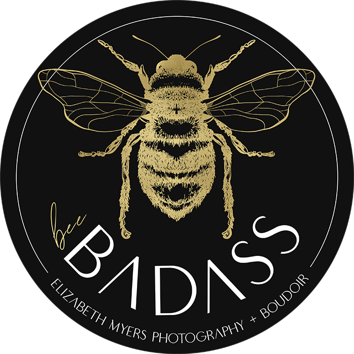
Plus, Elizabeth came in with the phrase “Bee Badass” – and wanted me to implement this in some branding tools for her presence. Of course, I was thrilled, because “Bee Badass” called for hand illustration, and I have major happy feels about hand illustration.
It was important to me to keep the elements clean and elegant, while infusing a bold tone that communicates that straight-up-badass mood across the presence.
I ended up bringing the bee into her secondary logo, as well as using it in a couple of marketing tools for an event she was going to be attending!

The Marketing Tools:
Elizabeth came to me with a challenge –
She wanted STICKERS. I love printing things – seeing content physically printed makes me so warm and fuzzy inside, and I love being able to be a part of the process for choosing a printer and making tools real. One of the elements of this sticker though, was making that shiny yellow looking portion, gold foil. Which meant choosing a printer twho could make that happen. Luckily, I had a vendor on my list who could do this perfectly, and as usual, they delivered an absolutely flawless product!!


Our final task was Elizabeth’s Website
And oh boy, was it fun!
Our Priorities
Elizabeth’s presence called for specifics
It’s fair to say that every project I work on calls for specifics – targeted work that is geared toward my client’s ideal customers. But Elizabeth’s project needed a little extra attention in this arena, specifically when it came to her web copy.
Although like I’ve mentioned, her work speaks for itself, we wanted to make sure that the badass, gives-no-fucks tone of her work, along with her unshakeable devotion to body-positivity, shone through in the copy of her site along with the imagery.
This is where things got fun for me. I crafted copy designed to show readers that regardless of their feelings toward their body – regardless of their struggles, they’re gorgeous. And not only are they gorgeous, they deserve luxurious experiences – self-care that makes them feel as beautiful as they truly are.
This copy is infused throughout the site, not only on the homepage, but in the frequently asked questions, in Elizabeth’s bio – everywhere there is an opportunity to imply body-positive tones, and remind women that their bodies are powerful, and worth documenting, we worked it in.
Also important to this balance, were the typography choices throughout the site. The primary messages, as you can see on the homepage presented here, are highlighted through a script font with messy, elegant movement. This messy, elegant movement parallels client’s internal thought processes – even if their internal thinking about their body is imperfect, and messy, it doesn’t make them less-than.
Of course, those kinds of intentional choices are functioning at a subconscious level – viewers on your site aren’t thinking actively about how the messy movement in a specific font relates to their own thoughts and experiences. But the implication and impact are still there, doing work for you on your presence.
The images themselves
One of the other exceptionally important elements of Elizabeth’s presence, was presenting images that show a wide variety of bodies, while also highlighting her absolute expertise in posing, prop selection, luxury session development, use of light, and set design.
So throughout the site, if you go take a look, you’ll see beautiful women – of all shapes, sizes, and ages, owning their absolute gorgeousness (which is a word, I just decided.)

Branding Design
Your brand should create an ecosystem for your work, no matter what you do. Your business should settle into the expanse of your branding - naturally, like magic. Making client conversion, EASY.
WEB DESIGN
Your website should be a lead generation powerhouse. Your ideal clients? They should feel at home there. This is where we put your brand to work for you.
Information about 1:1 support
Sometimes accountability is key, and having someone over your shoulder, making sure you're taking the steps you need to take is what makes the difference!

